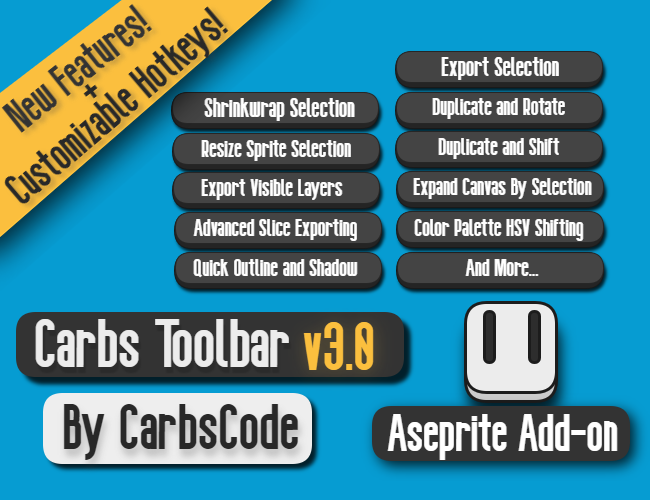
Carbs Toolbar
New Tab System In The Works, Does This Feel Better?
Working on Carbs Toolbar for a while today with a new idea of how to rework its current user interface and layout.
The hopes is to help ease the read-ablility for all it's features included and make it a bit easier to use and navigate all together.
I wanted to share a current vs new style comparison to see if this is something that you guys also think looks and feels better.
I also have been debating on if the help / info section should display information regarding your currently selected section instead of everything as well.
Current Released Style
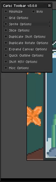
As you can see here in the current version, though you can have multiple sections open at once it can take up a lot of screen space and get a bit confusing to look at. Things just get a bit too cluttered now with having so many features!
New / Proposed Style
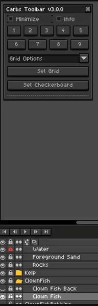
In the version I have worked on today I have implemented this dropdown / tab system that only shows the options for the selected section. You can use either the dropdown list or press the tab buttons to get to any of the current sections.
I'm interested what everyone thinks of this, should this be how the tool and its features are presented going forward?
Especially keeping in mind that more features could be added to the toolbar in the future.
There is still some quirks to fix up before I can release this in an update but wanted to share with you guys and see what you thought about it!
Hope everyone is having a great day! 😀
Leave a comment
Log in with itch.io to leave a comment.